For my magazine I will have to choose a register that appeals to my target audience of older teenagers. I will use an informal tone with colloquialisms and slang that teenagers use. I will use a variety of sentences such as simple, compound and complex to break up the pace of the article. I wouldn't use only simple sentences because it could sound patronising and the reader wouldn't enjoy the article as much. I will use technical language that links to the dubstep genre, as I am presuming that people who want to buy or have bought a dubstep magazine will understand this language. The sentences will be more active than passive so it keeps readers interested and maintains a fairly quick pace. I will use quotes from the artist I'm interviewing to make the article sound believable. I'm expecting the reader to be pleased by the article.
Thursday, 17 November 2011
Similar Product research contents page analysis "Q"
This “Q” contents page is well laid out with titles for the different types of features. It follows the house style of red, white and black. The top banner is black which makes the white writing really stand out. The “Q” logo is in the top left corner which again follows the house style. The red banners for the different features make them really easy to distinguish between. There is not many images as the page is more text based, what images there are though are linked with the text. The page is packed with text and images so there isn't any significant amounts of white space. Next to each of the features is a page number so people can easily navigate through the magazine finding the pages they want straight away. There are more than 25 features shown so my magazine will need many features as well. In the top corner there is the issue number, date and a website address. This issue has a special features box containing articles all bout one band. I could put something like this in my magazine to try and break up just a list of features.
Similar product research front cover analysis "Q"
On this “Q” front cover it has an image of The Kings of Leon breaking through glass coming towards the reader. This gives a feel of destruction and chaos which is associated with rock music. The banner at the side of the page has a white background which makes the text stand out more. The house style is red and white which is used throughout the cover with red writing and white backgrounds. At the bottom of the page there is a pull quote from an article inside the magazine which gains the readers interest. The cover isn't drenched in colour so it doesn't look too busy and overwhelming, colour is only used on parts where it needs to catch the readers attention. Another bands name is mentioned on the cover so the reader knows what else is in magazine. At the bottom corner of the page there is the price, issue number and bar code.
Tuesday, 15 November 2011
DPS Language Analysis
The DPS that we did our analysation on was Metal Hammer, this typical rock/metal magazine is ultimately targeted to a young audience, however the DPS was targeted at a higher educated mature audience.
This formal piece of writing is ideal for this type of audience because they are expecting a higher formality of text. 'Indeed, while the formula of a concept album', this example shows how much etiquette has been placed in this article. Another part to this article is how difficult the writing is, for example, 'Preconceived' and 'Fruition' these words are difficult to pronounce, this shows how difficult the writers have made this, this is suitable for there target audience. This is weird because Metal Hammer usually target this magazine at a younger teenage audience instead of a sophisticated audience. In this article we have found evidence of alliteration, 'Darkly Devious Dani', this a great example for alliteration since this is the main title of the article. i Another feature to this article is the grammar, the whole article is grammatically correct, 'Dani is exhibiting more than a few stereotypical female tendencies himself;' this shows that the whole article is showing perfect grammar.
Thursday, 10 November 2011
Similar Product Research DPS
This double page spread is very image led. The image is large and takes up most of the double page, this attracts the reader and makes them want to read on. At the left side of the page there is a large pull quote written in capitals wrapped around the image. Underneath the quote there is a banner containing the title of the article. Banners are usually at the bottom of the page but this one is raised a bit to break the background colours. The actual article starts with leading caps and a standfirst in capital letters, in this case it makes the name of the band stand out. At the bottom right of the page is the byline which states who wrote the article and took the photo. In the top right corner there is a caption describing the article. The colour scheme of the page is predominantly black and white with parts of red. These colours match the house style of the magazine. There is a lot of white space which stops the page from looking too busy. At the top of the left page there is a news banner which says what page it is.
Tuesday, 18 October 2011
Initial ideas and changes
I have decided to base my magazine on the Dubstep music style. The magazine will be called “The Drop”. I’ve called it this because it’s a term used in Dubstep, so people will instantly recognize it if they like Dubstep. The title will droop down so it looks like it’s dropping to tie in with the name. The magazine will be targeted at teenagers so the features will need to connect with them. The colour scheme will be blue and black to give it an electronic look. The cover will feature a photo of a Dubstep artist along with tag lines stating what features will be in the magazine. For my double page spread I will do an interview with a popular artist. The issue will be an Autumn edition. My contents page will look busy and will be packed with features and a variety of pictures. It will follow the house style, having the title in the top corner with the same blue and black colour scheme.
Survey and survey analysis
Survey
Gender;
Male [ ]
Female [ ]
Age;
12-14 [ ]
15-18 [ ]
18-20 [ ]
20+ [ ]
Favourite music genre;
Rock [ ]
Dance [ ]
Dubstep [ ]
R&B [ ]
Indie [ ]
Preferred colour scheme;
Blue & Black [ ]
Red & Black [ ]
Blue & Red [ ]
Green & Yellow [ ]
Purple & Blue [ ]
How regular should the magazine be;
Weekly [ ]
Fortnight [ ]
Monthly [ ]
Seasonally [ ]
How often do you buy magazines
Regularly [ ]
Every now and then [ ]
Rarely [ ]
Never [ ]
How much do you spend on magazines;
£1.00-£2.00 [ ]
£2.00-£3.00 [ ]
£3.00-£4.00 [ ]
£4.00-£5.00 [ ]
£5.00+ [ ]
What would you like for the double page spread;
Interview with popular artist [ ]
Interview with upcoming artist [ ]
Reviews [ ]
Games/Puzzles [ ]
Would you rather buy a cheaper magazine with no extras e.g CD, or more expensive with extras;
Without extras [ ]
With extras [ ]
The results of the survey show that most of the of the people that that took part in it were between 15 and 18 and the most popular music choices were rock and dubstep. Most people don't buy magazines that often and when they do, they normally go for cheaper ones without extras. The double page spread that people wanted to see most was the interview with a popluar artist and their preferred edition would be a christmas one.
The results of the survey show that most of the of the people that that took part in it were between 15 and 18 and the most popular music choices were rock and dubstep. Most people don't buy magazines that often and when they do, they normally go for cheaper ones without extras. The double page spread that people wanted to see most was the interview with a popluar artist and their preferred edition would be a christmas one.
Institutions Research
Bauer Media
Bauer Media is a division of the Bauer Media Group, Europe’s largest privately owned publishing Group. The Group is a worldwide media empire offering over 300 magazines in 15 countries, as well as online, TV and radio stations. Bauer Media joined the Bauer Media Group in January 2008.Bauer Media is a multi-platform UK-based media Group consisting of many companies collected around two main divisions – Magazines and Radio - widely recognised and rewarded as being industry innovators. The business is built on influential media brands with millions of personal relationships with engaged readers and listeners. The strategy is to connect audiences with excellent content through their broad multi-touch point brand platforms, wherever and whenever and however they want. The wide portfolio of influential brands gives them advantages over pure play magazine or radio competitors. The magazine heritage stretches back to 1953 with the launch of Angling Times and the acquisition in 1956 of Motor Cycle News, both still iconic brands within their portfolio. The seeds of the company’s radio business were planted in 1990 with the acquisition of London dance station Kiss FM (now called Kiss 100), followed by the acquisition of Liverpool's Radio City and later by TWC and the Metro Group. Then came the acquisition of Melody FM which was transformed into the market-leading Magic 105.4. In 1994, the company bought a small magazine called For Him Magazine which is now the core of the best-selling international multi-platform brand FHM.In 1996, they acquired digital music TV channel The Box, as a route into the small screen business, which has grown into Box Television, a seven channel joint venture TV business with Channel 4.Continuing its history of magazine launches, Closer was launched in 2002 and Britain’s first weekly glossy, GRAZIA, was launched in 2005.Today, Bauer Media spans over 80 influential brand names covering a diverse range of interests including heat – the must have weekly celebrity title, Parkers, MATCH!, CAR and Yours.
I would not pick this publishing company because they focus on an older audience and they don't really focus on Dubstep music. Instead they focus on more popular genres like pop music and glamour magazines. I would chose Development Hell instead because they focus more on dance and club music like with their magazine Mixmag, and at the moment they only have 2 magazines so they will be looking to expand their range.
Similar Product research contents page analysis "Kerrang"
On this “Kerrang” contents page it has a similar colour scheme as the front cover with the white, black and yellow. This contents page is in a different magazine to the front cover but it shows the house style as it has the same colours. The page is packed with pictures and text to leave as little white space as possible. The page lists twenty-four features of what’s in the magazine so my contents page will have to have a lot of features for it to look professional. The black writing on the white background makes it clear to read and the yellow headlines make them stand out so they draw your attention. The page has five different pictures of different bands so my page will need a variety of pictures too. The pictures are set out with a bigger picture which is most the likely the main article with smaller pictures around it. Up in the top right corner it says “contents” in the house style colours again with the issue number and date, this is repeated through each issue of the magazine. Under this is a quote from a famous artist, which makes the reader want to read on to see what else he says. This contents page is very well presented as it looks busy and is packed with information but it’s not too overwhelming.

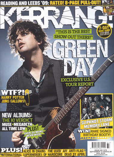
Similar Product research front cover analysis "Kerrang"
On this “Kerrang” magazine cover the title has lines through it to look like broken glass, this helps promote the idea of rock music. The white writing on the blue background makes it really clear and eye catching. Also because these colours are quite subdued the yellow boxes stand out and draw the readers attention straight away. Also because there are only three colours on the page it's not too busy and does't overwhelm the reader. The magazine is directed at a certain audience as it has colloquialisms like “WTF” and “booty”. These words are connected to teenagers and the inside features are about things teenagers like such as “Harry Potter” and bands they like. The magazine has a strap line that gives information about upcoming gigs and tells you about whats in the magazine “8-page pull-out”. This is a good idea as it may make readers want to buy the magazine more, so I may use this idea on my magazine. At the bottom it says what else is in the magazine so people might like them bands and so buy the magazine. The photo of Billy Joe Armstrong from Green Day shows him in black clothes which are usually associated with rock music. Also the way he looks off camera, almost uninterested, makes him look cool so people will want to be like him and so buy the magazine to see how to be like him. The price and issue are in the bottom corner in a white box so they're clear to see, also there is the website address so people can go to the website and learn more about the magazine.
Evaluation of what I have learnt so far
I have learnt how to use the macs correctly, being able to save my work properly and use the different software such as NeoOffice and Adobe. Before I learnt how to save my work properly I tried to upload my picture onto the blog but it was in the wrong format, but now I can upload pictures without problems. I have also learnt how to use adobe and be able to edit photos and change things, like being able to blur backgrounds and select certain parts of the photo. I can now use the cameras properly and take pictures correctly and know key terms and things to look for when doing photography, such as rule of thirds and the type of background to choose and what shot types to pick.
Preliminary task front cover analysis
For my front cover I have done the writing yellow because it stands out against the black and brick background also it helps draw the attention of the reader. I have done the title in capitals so that it stands out and again helps draw attention, I also made it look interesting by making the “the” bigger than the rest of the title. The background is plain so it doesn't distract people from the subject. The different tag lines are underlined so they stand out. A problem with the photo however is that it is more of a profile shot than a portrait shot. If I did this task again I would choose a different photo so it was tighter to remove some of the background and have the person stood more portrait.
Subscribe to:
Posts (Atom)