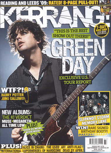
On this “Kerrang” magazine cover the title has lines through it to look like broken glass, this helps promote the idea of rock music. The white writing on the blue background makes it really clear and eye catching. Also because these colours are quite subdued the yellow boxes stand out and draw the readers attention straight away. Also because there are only three colours on the page it's not too busy and does't overwhelm the reader. The magazine is directed at a certain audience as it has colloquialisms like “WTF” and “booty”. These words are connected to teenagers and the inside features are about things teenagers like such as “Harry Potter” and bands they like. The magazine has a strap line that gives information about upcoming gigs and tells you about whats in the magazine “8-page pull-out”. This is a good idea as it may make readers want to buy the magazine more, so I may use this idea on my magazine. At the bottom it says what else is in the magazine so people might like them bands and so buy the magazine. The photo of Billy Joe Armstrong from Green Day shows him in black clothes which are usually associated with rock music. Also the way he looks off camera, almost uninterested, makes him look cool so people will want to be like him and so buy the magazine to see how to be like him. The price and issue are in the bottom corner in a white box so they're clear to see, also there is the website address so people can go to the website and learn more about the magazine.
Good Chris, a detailed analysis that comments on the key areas, including both image and language used. Try to incorporate more technical terms as you go.
ReplyDeleteMrs R